Slidegenius, Inc.

Professional Pitch Deck Designers and Cost-Effective Results

PowerPoint has become a standard in today’s business communications. It’s used in any type of industry, from startups to big-scale. Although it helps convey messages, professionals tend to use this tool by following a standardized format: stagnation.

A stagnant medium means everything looks the same. Everyone starts to rely on templates, and no one stands out. While PowerPoint’s user-friendliness makes it easy to create slides for any type of pitch deck, that also makes it more susceptible to uninspired decks.

However, there are some experts in the field who are equipped with the proper skills and knowledge to pull off a stunning deck for their clients. Availing the services of these professional PowerPoint designers can help you rise above the rest. Here’s why:

Professional Slides Make You Look Good

A team of dedicated and experienced designers, copywriters, and marketing consultants give you the best pitch deck possible, ensuring you always look your best. Designs are custom-made to suit your company’s needs, while still being in line with your image and branding.

With this important responsibility off your shoulders, you can breathe easily and concentrate on your responsibilities as the presenter.

Save Time and Money

Having a professional team means you can get your slides whenever you need them.

If you’re usually in charge of making your own slides, you can instead put your efforts into something more productive. If you’re in charge of a team, you won’t have to disrupt the process or wait for a member to be free to start your deck.

Having to occasionally design pitch decks in-house disrupts an employee’s regular workflow. According to Demand Media’s George Root III well-planned task delegation is necessary for more efficient work output. This means that you need experts in the specific fields for faster, optimized work.

Outsourcing a team of professionals on standby means your people can concentrate on what they do best: working to further improve your product or service. With disturbances gone, office efficiency is boosted, saving both time and money.

Increase Returns

Nothing beats output done by experts. When you hire professional pitch deck designers, your deck’s quality will always match that of your company’s, allowing you to convert more opportunities into revenue and making your business grow.

Amazingly well-made decks ensure consistent positive feedback, maximizing returns for you and your company.

Conclusion

No matter how good of a presenter you are, you’ll always need a pitch deck that reflects your skill and talent, as well as those of your team and your company’s brand message.

Though they have become too standard for their own good, pitch decks are still your gateway to effective business communication. Hire a professional pitch deck designer now and make your business stand out.

Still unconvinced? Contact us now, and let our team of professional pitch deck designers change your mind.

References

Root, George. “Importance of Teamwork at Work.” Chron. Accessed July 24, 2015.

How Much is a Professional Pitch Deck Design Worth?

“How much will a professional pitch deck design set me back?”

We hear this question a lot. Because of the program’s user-friendliness and the misconception that substance trumps design, presenters often misuse PowerPoint and come up with slides that bore their audience to death. The presentation tool has been constantly evolving and coming up with new features to make creating a more engaging deck easier even for the most unversed users.

At the same time, the cost of investing in one expertly-made deck can reap plenty of returns. Let’s talk about what you can get for three different pricing selections, from low to high.

Budget-Friendly (USD 1,000 to USD 5,000)

A budget-friendly pitch deck design is ideal for businesses with limited funds. This affordable package fall into two categories—a simple redesign of an existing deck, or a completely new yet bare-bones deck.

You won’t get subpar quality despite its low price range. You’ll still get the best out of your content, and a fleshed out deck states your purpose and speaks for your brand. However, don’t expect a lot of flourishes, animations, or additional branding advice

A professional pitch deck design is an investment. Don’t settle for less.

If you’re ready to go to the next level, the next price point might be more appropriate for your needs.

Fine-Tuned (USD 5,000 to USD 15,000)

As most clients’ choice, it’s a versatile service that meets most business needs, big or small.

More slides cost more time and effort. The wider price range has a bigger chance of optimally meeting your pitch deck needs. Costs in this price range depend on the amount of copywriting, design, and multimedia efforts you’ll request. If you need more, you’ll get more.

Have a bigger budget than this? Let’s go above and beyond the usual pitch decks and dive into the best of the best.

All-In (USD 15,000 to USD 50,000)

This range includes multi-deck projects and large decks with more than a hundred slides. You get a lot of value with expertly-designed slides that don’t pull any creative punches while maximizing both graphical and written content.

If you’re a start-up looking to break the mold, this package provides a complete branding overhaul that exceeds a standard pitch deck’s limitations. You can also get a library of custom-designed ready-to-use slides. Get your money’s worth and more with this great investment. All it takes is one big push to get the ball rolling.

You need to spend money to make money. Talk to a pitch deck specialist and find out what best fits your need for a professional pitch deck design. Contact us now for a free quote!

References

How to Avoid ‘death by PowerPoint‘.” BBC News. December 18, 2015. Accessed July 27, 2015.

A Pitch Expert’s Guide to Great Pitch Deck Ideas

A professional pitch takes time, not just in making the actual pitch deck, but in planning how to make it.

Pitch experts (even the ones behind Apple’s and TED Talks’ pitch decks) recommend spending the majority of your time planning for how to make and deliver the sales pitch. According to brand communication expert, Carmine Gallo, this takes at least 90 hours, with only a third of that time used for building the actual deck.

pitchdeck.com Blog Module One

We redesign pitch deck presentations.

Get your free quote now.

get a free quote

The rest of the time needs to be spent on knowing your client’s expectations. Qualtrics’ Scott Smith presents seven customer expectations to watch out for, so make sure to dedicate your time to researching the topic, and developing an effective method of delivery.

Ask yourself:

  • What problem am I trying to solve?
  • Is there an applicable solution that I can use?
  • How will I solve the problem then?
  • What advantage can I offer that the competition can’t?

A secret to getting effective pitch deck ideas is planning ahead of time.

Let’s go into detail about how to plan your business pitch.

Step 1: Write Everything You Want to Say

Make a list, sit down with your colleagues, consult your company’s production/research teams, draw quick sketches and draft a script. Just get something, anything on paper when you start.

This way, you’ll have an easier time sorting through pitch deck ideas that work from those that don’t.

Both professional presenters and advertising experts talk about similar methods. Whether it’s planning on paper or, as ad veteran Luke Sullivan suggests, sticking drawings of your best ideas on the wall, the best way to get your sales pitch idea is to dump everything into an empty space and sort them out.

Step 2: Be Your Own Coldest Critic

Once you have everything you can think of in one place, be it an empty Microsoft PowerPoint file or on blank sheets of paper, start judging. Using the questions listed above can work as your guide.

Everything you place in your pitch deck stems from two sources: the client’s problem and the product or service you’ll use to solve it. The strategy is up to you. Consider the following questions:

  • Do you want to bank on your company’s reputation for being the best in the business?
  • Do you want to highlight one advantage you have over the competition?
  • Do you want to introduce a game-changing solution to an old problem?

pitchdeck.com Blog Module One

We redesign pitch deck presentations.

Get your free quote now.

get a free quote

Your ideas must fit whatever strategy you choose.

If you want to pitch for a car-rental service provider, or sell your electronics to a local distributor, ask yourself about the workability of your idea (for example, displaying consistent sales numbers or user testimonies). If you think it’s doable, keep it.

Step 3: Once You Have the “Eureka” Moment, Stay on It

One benefit of dumping your ideas and being your harshest critic is that you arrive at your winning sales pitch idea faster.

Everything you say and write will flow by themselves if your idea and strategy are sound enough. The best thing to do is stay with it.

Write down your script and slide content while your thoughts are still fresh in your mind. Delaying it will interrupt your train of thought, wasting time better spent on finalizing your pitch deck.

The Lesson to Learn

Don’t be afraid to critique your own ideas. A sales pitch is all about testing ideas against the client’s problems and coming up with your best solution.

If it works, come up with an appropriate strategy to sell your proposal better than the competition does. Keep at it until you find your selling idea.

To help you come up with it even faster, spend time with a pitch deck expert. It’s worth the investment. (All it takes is fifteen minutes.)

References

Gallo, Carmine. The Presentation Secrets of Steve Jobs: How to be Insanely Great in Front of Any Audience. New York. McGraw-Hill, 2010
Smith, Scott, “Customer Expectations: 7 Types all Exceptional Researchers Must Understand.” Qualtrics. Accessed July 15, 2015.
Sullivan, Luke. Hey, Whipple, Squeeze This! A Guide to Creating Great Ads. Hoboken, NJ – J. Wiley & Sons, 2008

Featured Image: “Spiral Notebook Notepad Block Pen.” from pixabay

3 Effective Tips for Simplifying Pitch Deck Slide Designs

We’ve said before that simple slide designs are every professional presenter’s bread and butter. Whether they’re TED Talk speakers or Steve Jobs, all of them rely on slides that feature one visual and one caption, allowing them to get their point across clearly.

pitchdeck.com Blog Module Three

Get hundreds of pitch deck slides for free.

Sign up for your free account today.

Sign Up now

These slides aren’t used as scripts. After all, professional presenters use them to help the audience visualize what they say while they use an informal, conversational tone. According to brand communications expert, Carmine Gallo, they also support their speech with at least three important points centered on a main idea.

While we can talk about the benefits of simplified pitch deck slide designs, it’s also important to know exactly how to do them.

Ad veteran Luke Sullivan cites top advertising professionals as those who make simple, effective advertisements by boiling them down to one main element.

Three Simple Questions to Answer

A typical pitch deck slide contains an image, a headline, a caption, body text, and sometimes lists and bullet points. While they contain the information you need, slides like these can end up overloaded and confusing.

Reduce your slides to the essentials with these questions:

1. Can You Make Your Slide Work Without the Body Text?

Pasting text on the slide and reading it out ends up alienating you from your audience and cutting potential for interaction with them.

Don’t recite a script. Instead, tell them a compelling story and giving them reasons to invest in your proposal. Remove the text from your slides if your visuals can work without them, no matter how well-written they may be.

This will make your layout cleaner and let you talk more. Your pitch deck is there to help your audience visualize what you’re supposed to say, not give you an on-stage script.

2. Is Your Caption Bringing Any New Information?

Your caption should support your image.

Let’s take a look at one of Gallo’s examples — Steve Jobs pitch decks. The caption “1000 songs in our pocket” was superimposed with the image of an actual pants pocket to show the iPod Nano’s main feature.

This is similar to author Jim Aitchison’s example of the style used in the Volkswagen ad featuring a lunar landing craft with the caption “It’s ugly, but it gets you there”. These effective captions bring new information that’s not seen in the visual, but if your image can work without it, so much the better.

A print ad for The Economist only had the image of a keyhole with the magazine’s logo at the bottom.

While part of a campaign, this showed that the publication was the key to unlocking useful industry secrets and information that only its readers can enjoy.

3. Do You Need a Title, or Can the Visual Speak for Itself?

Sometimes, presenters use titles on top of their slides to separate different sections.

In theory, this sounds logical, but if your visual can speak for itself, or if you tell your audience what you want to talk about in the next part of your pitch deck, why use a title?

A simple headline on the slide itself or a single image shown front and center works better.

Ensure that only one element is prominent in your slide. This makes it easier for your audience to read your text, and keeps their attention focused on you.

Keep the Audience’s Eyes on You

You can make pitch deck slide designs comparable to those used by Steve Jobs and TED speakers by following this principle of simplicity.

This exercise is difficult when you’re tempted to paste everything into your slides. You’re the one giving the pitch, not your pitch deck. Keep your audience focused on what you say.

To help you make simple but effective pitch deck slides, all you need is fifteen minutes to get in touch with our pitch deck experts.

pitchdeck.com Blog Module Two

Download free pitch deck templates now.

Get professionally designed pitch deck slides weekly.

Sign Up Now

References

Aitchison, J. Cutting Edge Advertising: How to Create the World’s Best Print for Brands in the 21st Century. Singapore; New York: Prentice Hall, 2004.
Gallo, C. The Presentation Secrets of Steve Jobs: How to be Insanely Great in Front of Any Audience. New York: McGraw-Hill, 2010.
Sullivan, L. Hey, Whipple, Squeeze This: A Guide to Creating Great Ads (3rd Ed.). Hoboken, N.J.: John Wiley & Sons, 2008.
The Economist: Keyhole.Adsoftheworld.

Great Pitch Deck Presentations Need Great Main Ideas

Every effective proposal begins with a main idea. Brand communication expert Carmine Gallo (2010), recommends identifying that idea and explaining why it matters.

This grounds your pitch deck on a specific topic and keeps you from straying too far from what you want your audience to remember.

Getting to that point is tricky, but don’t worry, every problem has its own unique solution.

pitchdeck.com Blog Module Three

Get hundreds of pitch deck slides for free.

Sign up for your free account today.

Sign Up now

If your company needs to introduce a new product in a technology expo, how will you go about explaining this new device? Will you start with its specs, or elaborate on how it stands above your competitors?

All great pitch deck presentations begin by asking these kinds of questions. Regardless of the specific problem and approach, there are three things that can flesh out your main ideas:

Identifying the Problem

A sales pitch is directed to address an issue. It could be anything—low sales returns, re-branding, or it could simply be the need to introduce a new product.

Find the root of your client’s dilemma to keep your pitch focused on presenting an on-strategy solution.

Once you have this information, the next question is: “Why?

Why is the product necessary? Why do your clients have to listen to you? Why shouldn’t you let that issue go unsolved?

Addressing the whys define the gravity of the situation.

It also establishes the relevance of your idea, helping you find the necessary insights to back up your claim.

Target Audience

An idea can affect people, especially if it agrees with what their beliefs. This is why it’s crucial to know exactly who you want to talk to.

These people are the ones looking for the cures to their headaches. You have to show them that you share something in common.

Try to remember the last product you bought. It could be a gadget, a car or even a pair shoes. If you bought these from specific brands, think about why these companies gain the most attention from consumers.

According to Chuck Brymer’s article on Marketing Magazine, the reason the best brands stay the best is because they give you what you need and strive to stay relevant.

They also use common values their customers relate to.

Every company stands for something. Some want to provide a fun experience by creating superior products while others may believe in making things more convenient by engineering easy-to-use technology. As long as a brand lives, its values should never change. It needs to keep itself relevant as time passes.

When pitching an idea, always keep your company’s beliefs in mind—make sure these beliefs match those of your client’s.

Aligning with the Client’s Strategy

Insights work both ways. While your insight inspires strategies, make sure that whatever solution you come up with doesn’t conflict with your client’s corporate values.

For example, would Apple accept a cheaper but less reliable supplier? Since Apple offerings are known for being stylish and easy to use, they probably wouldn’t if it compromises their overall product quality.

Compare your proposals with your client’s business goals. Propose alternative insight to an idea that might negatively affect your client’s business.

This part of the process is arguably the strictest of them all. It tests whether your offer is resilient but flexible enough to adapt to your client’s needs.

Once you satisfy this condition, you’ll have an easier time outlining your topic in pitch deck form.

Offering answers won’t do any good if you can’t justify them. That’s why simplifying your pitch ensures clearer communication between you and your audience.

To better remember these techniques, condense this three-step process into a single formula—find the root cause of the client’s dilemma, and find the insight that will lead to the answer.

If this is in line with the client’s corporate beliefs, it’s a valid solution. If not, consider an alternative.

Once you consider these questions when pitching a topic, you’ll be more likely to get on-point with your target market’s needs.

Understanding the main reason people need your company’s work makes it easier for you to convince others that they should get on board with your idea.

pitchdeck.com Blog Module Two

Download free pitch deck templates now.

Get professionally designed pitch deck slides weekly.

Sign Up Now

References:

Brymer, C. “What Makes Brands Great.” Marketing Magazine. 2004. Retrieved from:
Gallo, Carmine. The Presentation Secrets of Steve Jobs: How to Be Insanely Great in Front of Any Audience. New York: McGraw-Hill, 2010.

Featured Image: Stock Photography of A businessman working on modern technology on fotosearch.com

Make an Impact and Deliver Better Business Pitches

For most professionals, typical business pitches include having to sit through monotonous discussion while trying to decipher the small text projected in front them.

While these scenarios are common, bland business pitches shouldn’t be the norm.

pitchdeck.com Blog Module Three

Get hundreds of pitch deck slides for free.

Sign up for your free account today.

Sign Up now

For your big pitch, turn the situation around and deliver something memorable that will leave a lasting impact on your audience. That’s why we decided to review the different things you can change and emphasize for your business pitch.

Take note of these essential characteristics and learn to apply them to your work:

Authenticity

The problem with most business pitches is that they often lack emotional impact.

Because they’re delivered in formal settings, presenters think that business pitches need to focus on the hard facts.

While data is obviously important to help build the credibility of your pitch, you still need to add a human element in order to create a connection with the audience. What better way to capture their attention and keep them engaged than by building this important rapport?

Of course, this doesn’t mean that you have to try and move your colleagues to tears or leave them rolling on the floor with laughter. Your goal is to build an authentic experience for them. Instead of presenting overwhelming amounts of charts and data, try to integrate a story to your pitch deck.

Thorough

Following our previous point, you’ll know that business pitches commonly suffer from information overload.

Without setting a clear goal, presenters tend to add too much to their content and end up prolonging the discussion with repetitive details. That’s why business pitches need to be thoroughly prepared. Solve the dilemma of an unorganized discussion by defining a clear objective.

From there, meticulously curate your content to make sure everything is aligned with your goals. Cut back on the data you present and include only the numbers that are most important to help drive home your key takeaways.

Compelling

To make an impact with your business pitches, you also have to focus on how well you face the audience and deliver your speech. If you want the audience to sit up and listen, focus on creating a compelling and engaging atmosphere.

As you start your pitch, catch their attention through nonverbal cues. It’s not enough to speak with confidence, you also have to exude the same amount of credibility in the way you dress and carry yourself. Avoid slouching or gestures that make you seem closed off or aloof.

Don’t be too stiff—try to strike a balance between both feeling comfortable and commanding authority in front of an audience.

Visually Stimulating

Finally, business pitches also need to break out of the “Death by PowerPoint” mold.

Instead of undecipherable pitch deck slides, you need to come up with a pitch deck that is visually stimulating and interesting.

This will elevate the message presented in a pitch deck. That said, it shouldn’t overshadow the core message with walls of text and misused bullet points.

Appeal to the visual sense of the audience. Apart from carefully curating your content to make sure you don’t end up with too much text, choose high-quality images to visualize your points.

Don’t forget to pick out a striking color palette and a few interesting fonts as well.

Looking for inspiration from design experts? Take a look at our design portfolio or contact us for a free quote today!

Your business pitches do not have to lull the audience to sleep. Keep your colleagues engaged by making an impact they won’t soon forget. Take note of these 4 essential tips and deliver the best business pitches they’ll ever see.

pitchdeck.com Blog Module Two

Download free pitch deck templates now.

Get professionally designed pitch deck slides weekly.

Sign Up Now

References:

Hook, Line, and Sinker: What Makes a Great Pitch Deck Story.” pitchdeck.com December 11, 2014. Accessed February 26, 2015.
Non-Verbal Communication.” Skills You Need. Accessed February 26, 2015.
Understanding Information Overload.” Infogineering. Accessed February 26, 2015.

Featured Image: Startup Stock Photos

How to Prepare a Flipbook: The Pitch Deck’s Fine Print

As we’ve established in the past, a majority of people respond positively to visual information. Avoid unloading too much data on your audience and trying to fit everything in a short series of slides.

This doesn’t mean that you can leave out the fine print completely. Sometimes key individuals like investors in your audience will want a closer look at the details.

As a solution, provide them with a flipbook—a document where they can examine the details they need in their own time.

Unlike a pitch deck, a flipbook carries a lot more text and information. It’s similar to a report, but with a better sense of design. Even if it’s meant to act as a supplementary document, a flipbook will need to be as visually engaging as the presentation you delivered.

Here are our top pointers to make sure your flipbook works well with the rest of your presentation:

Your flipbook needs to stand out

Business documents are often kept simple, printed in a subtle black and white. However, if you’re looking to impress people, you need something more that will encourage your recipients to keep flipping through the pages.

As with a pitch deck, make sure that key information stands out in your flipbook. Learn to experiment with different design elements to add life to the information you’re presenting.

While expounding on details, make use of images, illustrations, and color accents to help key points stand out.

Keep basic design principles in mind

Even as you make sure your flipbook stands out with great design, still be mindful of the same principles that guide your pitch deck.

Remember that people have limited attention spans, and need room to relax their gaze so they can focus on more important objects.

Continue to observe basic design elements such as contrast, white space, and the rule of thirds in order to strike the perfect balance.

You’ll be able to grab your viewers’ attentions without saturating them with too many slide elements this way.

Structure your content properly

Proper structure helps your document become much easier to read, regardless of its length. If you can cut up your content into consumable chunks, recipients will be able to easily scan your document for the information they need.

For some tips, here are just a few ways you can keep your content organized:

  • Break down discussion with headlines
  • Highlight the key takeaway with a subheading
  • Discuss a single point per paragraph
  • Use bullet points to list down key information
  • Add pull-quotes to emphasize important parts of your content

Use grids and columns as a layout guide

Documents are also much harder to read when the layout is haphazardly done. You can’t just arrange your content randomly.

Make sure your layout encourages the reader to keep going, guiding them from one point on the page to the next.

To solve this problem, utilize grids and columns as you format both design and content.

Design blogger, Sean Hodge, explains in his article on Smashing Magazine, the benefits and purpose of grid-based design. Hodge included a grid’s optimization of variety and transformation of disharmony into something that enhances design rather than detracts it.

These can guide you in arranging your content in a satisfying and creative layout, so make use of them for visual appeal.

Whether you’re creating a pitch deck or a flipbook, powerful visuals play an important role in helping your ideas stand out. If the occasion calls for a closer look at the details, give the audience your presentation’s fine print. Follow these tips to prepare a flipbook that magnifies the importance of the message you’re delivering.

References

Hodge, Sean. “Grid-Based Design: Six Creative Column Techniques.” Smashing Magazine. March 25, 2008. Accessed February 6, 2015.
Pitch Deck Lesson: The Rule of Thirds in Slide Design.” pitchdeck.com, November 10, 2014. Accessed February 6, 2015.
The Visual (spatial) Learning Style.” Learning Styles. Accessed February 6, 2015.
Watson, Leon. “Humans Have Shorter Attention Span than Goldfish, Thanks to Smartphones.” The Telegraph. Accessed February 6, 2015.

Featured Image: siBorg via Flickr

Presentation Tips: 5 Quick Ways to a Pitch Deck Design Boost

Do you still have a pitch deck that needs to be wrapped up before the year ends? Don’t forget to give your pitch deck design a much needed boost. As you know, it’s important to end the year with a bang. The last message you share for 2014 should resonate with the audience. Aside from learning the best way to communicate with them, you have to make sure that your visuals are eye-catching and unforgettable.

Here’s a quick rundown of simple tips and tricks for a pitch deck design boost: 

1.) Use bullet points correctly 

As we mentioned previously, there’s a time and place for bullet points in your pitch deck design. Most people use bullet points to list down lengthy paragraphs of text when they should only be used to list down key information. In other words, using bullet points should help you present details in a way that’s easy for your audience to digest. You don’t use them to cram a dozen different sentences in a single slide. You use them to create a list of important information that the audience can easily see and discern. There’s nothing wrong with using bullet points, but don’t forget that there’s a right way to utilize them.

2.) Experiment by creating custom templates 

If you’re in a hurry to finish your pitch deck, using PowerPoint templates will definitely make the job easier. However, these templates often have a reputation of being boring and repetitive. Luckily, there’s a way you can use them without sacrificing your creativity. As we detailed in this tutorial, you can create custom pitch deck designs by using the Slide Master option. It might take a bit more effort, but it’s worth it to have a template that’s unique to your pitch deck. Tailor fit any template for your specific situation by changing up the look to match your branding.

3.) Create the perfect mood with the right colors

Speaking of branding, picking the right colors is one of the best ways to make sure your business identity is evident in your pitch deck design. The correct color choices will also add more dimension to what you’re delivering. Since colors are often have specific cultural associations, choosing the right color will help you add more meaning to the topic you’re tackling. For example, the color blue and gray is often associated with professionalism. On the other hand, the color purple connotes luxury and exclusivity. If you want to create a palette that matches the mood of your pitch deck, do some quick research on the different cultural associations behind specific colors. You can start here.

4.) Find balance by using well-matched fonts

It’s also important to keep your pitch deck design well-balanced and harmonized. One way you can do that is by making sure you choose fonts that match each other. Even when you have plenty to choose from, make sure that your fonts complement each other. You can opt for a contrasting Serif and Sans Serif pair, but you can also create a unified look by choosing fonts from the same family or typeface. Whatever you decide, just make sure to limit your choice within 2-3 styles. Going overboard will create too much distraction and your pitch deck design will end up looking inorganic. Another important rule to keep in mind is readability. Make sure everything in your slides can be read by the farthest person from the screen.

5.) Highlight your message with the perfect images

Finally, your pitch deck design won’t work if you don’t have images to illustrate your points. This is a tip we’ve repeated so much in the last year because it should never be left unsaid. Your pitch deck design will be far more effective if you let go of lengthy paragraphs and use images to highlight your message instead. The Internet is a great source to find whatever you need. Take the time to browse through all these sites to find something that will help you tell the story of your pitch deck. Visual storytelling is a growing trend in the world of business, so make sure your pitch deck design doesn’t fall behind.

These tips may seem ordinary, but they all bear repeating. You can’t expect to boost your pitch deck design if you don’t start at the basics. Follow these tips and work your way towards more creative and memorable pitch decks.

If you need more help, don’t hesitate to reach out and contact our pitch deck design experts!

Featured Image: Life of Pix

Pitch Deck Design Tips for Presenting Data

Dealing with data is a crucial part of any pitch deck. When the stakes are particularly high, presenting data is the best way to add weight and leverage to your ideas. If you want to make sure your pitch holds up, you need to provide evidence that will support your main arguments.

The only problem with data is when you have too much. As we’ve constantly established, simplicity is an important factor in pitch deck design. How can facts and figures be helpful if they only end up confusing your audience? When it comes to presenting data, you’ll need to cut back on complex graphs and lengthy explanations. The best way to present data is through concise visuals that are both striking and creative.

pitchdeck.com Blog Module Three

Get hundreds of pitch deck slides for free.

Sign up for your free account today.

Sign Up now

Before anything else, you need to think of data in your pitch deck as an iceberg. The part we see floating in water is said to make up only 10% of its entire mass. The rest of it is underwater, hidden from plain sight. Similarly, the data you include in your pitch deck should only be a small part of the information you have available. A lot of research and hard work goes into gathering data for a pitch deck, but you can’t expect to include everything in your slides.

Data in your presentations should act like an iceberg
Like an iceberg, don’t show your audience every bit of information you have. The data in your pitch deck should only be a small part of everything you’ve gathered during research and preparation. (Source)

In other words, the data you include in your pitch deck should be the ones that are most crucial to making your point. Before you start building your slides, review the information you have and figure out what each stands for in relation to your core message. The numbers that stand out the most are the most significant to your key arguments.

With that said, here are a few more tips to keep in mind when you’re presenting data:

Figure out the best way to visualize your data

After deciding which of the information you have is the most relevant to your pitch, the next thing you need to do is to turn your data into visuals. Review the different types of charts to find out which one works best for the numbers you have. Check out these resources to learn more about choosing the most suitable format for your data:

The charts in your pitch deck should make sense without too much explanation. Make sure you choose the correct format so that you can get the simplest and most streamlined illustration. Basically, line and bar charts are great for emphasizing trends. Meanwhile, a pie chart is perfect for illustrating how specific numbers correspond to a whole.

chart data sample

There are also times when it’s better to avoid using charts at all. Certain data is better presented through a simple illustration. If you’re not comparing several numbers, maybe a single but striking graphic is enough to prove your point.

illustration data sample

Be creative with your visualization 

Presenting data doesn’t have to be boring, so keep your visuals interesting. It’s not enough to turn your data into simple charts or illustrations. You also need to take note of a few pitch deck design principles.

In our discussion on top pitch deck design practices, we discussed how some factors—particularly the use of images, color, and space—can make a huge difference in the look of your slides. If you want your data to pop, make sure you learn how to use and manipulate these elements in your visualizations. Look through our portfolio for inspiration.

black friday data
Data about Black Friday shoppers visualized in an infographic on Visual.ly

Highlight the insights 

Aside from great design, it’s also important to highlight what your data is about. When it comes to presenting data, the audience isn’t particularly interested in seeing exact figures. What they want to see is the logic behind the numbers. Why are they important? What point are they trying to make?

To avoid confusing the audience, make sure your slides feature a short explanation of your data. Caption your charts or illustrations with a few short sentences that can briefly explain what your data represents. Here’s another example from the pitchdeck.com portfolio:

RecoverBrands_1

When you’re delivering your pitch, it will also help if you lead with the conclusion. To present everything clearly, you’ll need to show the bigger picture before going in to the finer points of your data.

pitchdeck.com Blog Module Two

Download free pitch deck templates now.

Get professionally designed pitch deck slides weekly.

Sign Up Now

Featured Image: Nic McPhee via Flickr

Pitch Deck Lesson: The Rule of Thirds in Slide Design

It seems like 3 really is a magic number—particularly when it comes to pitch decks. First, there’s the rule of threes. If you remember, we previously talked about how Steve Jobs and Tim Cook would masterfully structure their Apple keynotes into 3 main parts, making their discussions easier to understand. And now, there’s the rule of thirds. This will help ensure that your slides are both captivating and well-balanced.

What is the rule of thirds?

The rule of thirds is a basic guideline used in visual composition, most commonly associated with the field of photography.  Basically, it suggests that your canvas should be divided into thirds or 9 equal parts. The focal points of your design should then be placed along the lines or intersections that make up these parts.

rule of thirds picture sample
(Photo Source)

As you can see, the photo’s subject is perfectly aligned with the vertical line on the left side. The book and the hand that’s holding it in place are both on an intersection in the grid. (Quick fact—in technical terms, these intersections are referred to as “power points”!)

According to experts, using the rule of thirds will make your visual compositions a lot more interesting. David Peterson, a professional photographer, had this to say about why this technique works:

[If] your subject is in the middle of the image, it’s considered static. Your eye is drawn to it then has nowhere to go from there because the object is equal distance from all sides. Therefore when your subject is positioned closer to one of the edges, it forces your eye to follow it…to find it. This allows the viewer to linger on your image longer. It makes for a more captivating photo because it’s almost interactive. Like a conversation going on between the photo and you.

Of course, this isn’t only true for photography. The rule of thirds can also be a useful guide when designing pitch decks. As internationally acclaimed communication expert, Garr Reynolds puts it, “you will find that you can apply this guideline even to PowerPoint or Keynote visuals to give them a more symmetrical and professional look“.

Here are a few samples to illustrate:

rule of thirds powerpoint slide sample 01

You can see how the logo is placed in the upper left third of the slide, near an intersection. The main visual—picture of a tablet showcasing how the product works—is placed in the lower right third of the canvas, also near a “power point”.

rule of thirds powerpoint slide sample 02

In this slide, the focal point of this slide is placed in the left third of the canvas. Meanwhile, the accompanying text is in the lower right third.

rule of thirds powerpoint slide sample 03

Here, the logo is near the upper left “power point”. This is balanced by how the brief text is aligned to the right, near the lower horizontal line. The way the background is composed also follows the rule of thirds. Notice how the corner where the road turns is near the lower left intersection.

How to use the rule of thirds in pitch deck design

With all that said, here’s a quick tip that can help you apply the rule of thirds when working in pitch deck. Some designers might be able to imagine where each guide line should go. For beginners, you can enable drawing guides to divide your slides easily.

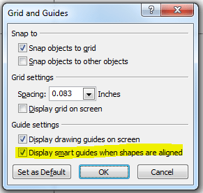
Right click on any area in the slide pane and choose Grids and Guides from the menu. When the dialogue box pops up, check the option for “Display drawing guides on screen”.

rule of thirds powerpoint steps 01

You’ll get two guidelines that intersect at the center of your slide. That means you’ll have to move them around to create 9 equal parts. Luckily, Gavin McMahon of makeapowerfulpoint.com already did the math. To create the guides, drag the horizontal line to 1.25 and the vertical line to 1.67. Repeat the step by holding down CTRL and dragging the lines to the opposite direction, placing them on the same coordinates. (For widescreen presentations, the horizontal guides should be placed on 0.92 for the 16:9 setting and 1.00 for 16:10.)

With these guide lines, you can easily see if your the layout and design of your slides are well-balanced and symmetrical. Try to play around with an old pitch deck and see how you can improve your designs with the rule of thirds.

Featured Image: From the pitchdeck.com portfolio