Slidegenius, Inc.

Presentation Tips: 5 Quick Ways to a Pitch Deck Design Boost

Do you still have a pitch deck that needs to be wrapped up before the year ends? Don’t forget to give your pitch deck design a much needed boost. As you know, it’s important to end the year with a bang. The last message you share for 2014 should resonate with the audience. Aside from learning the best way to communicate with them, you have to make sure that your visuals are eye-catching and unforgettable.

Here’s a quick rundown of simple tips and tricks for a pitch deck design boost: 

1.) Use bullet points correctly 

As we mentioned previously, there’s a time and place for bullet points in your pitch deck design. Most people use bullet points to list down lengthy paragraphs of text when they should only be used to list down key information. In other words, using bullet points should help you present details in a way that’s easy for your audience to digest. You don’t use them to cram a dozen different sentences in a single slide. You use them to create a list of important information that the audience can easily see and discern. There’s nothing wrong with using bullet points, but don’t forget that there’s a right way to utilize them.

2.) Experiment by creating custom templates 

If you’re in a hurry to finish your pitch deck, using PowerPoint templates will definitely make the job easier. However, these templates often have a reputation of being boring and repetitive. Luckily, there’s a way you can use them without sacrificing your creativity. As we detailed in this tutorial, you can create custom pitch deck designs by using the Slide Master option. It might take a bit more effort, but it’s worth it to have a template that’s unique to your pitch deck. Tailor fit any template for your specific situation by changing up the look to match your branding.

3.) Create the perfect mood with the right colors

Speaking of branding, picking the right colors is one of the best ways to make sure your business identity is evident in your pitch deck design. The correct color choices will also add more dimension to what you’re delivering. Since colors are often have specific cultural associations, choosing the right color will help you add more meaning to the topic you’re tackling. For example, the color blue and gray is often associated with professionalism. On the other hand, the color purple connotes luxury and exclusivity. If you want to create a palette that matches the mood of your pitch deck, do some quick research on the different cultural associations behind specific colors. You can start here.

4.) Find balance by using well-matched fonts

It’s also important to keep your pitch deck design well-balanced and harmonized. One way you can do that is by making sure you choose fonts that match each other. Even when you have plenty to choose from, make sure that your fonts complement each other. You can opt for a contrasting Serif and Sans Serif pair, but you can also create a unified look by choosing fonts from the same family or typeface. Whatever you decide, just make sure to limit your choice within 2-3 styles. Going overboard will create too much distraction and your pitch deck design will end up looking inorganic. Another important rule to keep in mind is readability. Make sure everything in your slides can be read by the farthest person from the screen.

5.) Highlight your message with the perfect images

Finally, your pitch deck design won’t work if you don’t have images to illustrate your points. This is a tip we’ve repeated so much in the last year because it should never be left unsaid. Your pitch deck design will be far more effective if you let go of lengthy paragraphs and use images to highlight your message instead. The Internet is a great source to find whatever you need. Take the time to browse through all these sites to find something that will help you tell the story of your pitch deck. Visual storytelling is a growing trend in the world of business, so make sure your pitch deck design doesn’t fall behind.

These tips may seem ordinary, but they all bear repeating. You can’t expect to boost your pitch deck design if you don’t start at the basics. Follow these tips and work your way towards more creative and memorable pitch decks.

If you need more help, don’t hesitate to reach out and contact our pitch deck design experts!

Featured Image: Life of Pix

Hook, Line, and Sinker: What Makes a Great Pitch Deck Story

What makes a great pitch deck? Before anything else, your pitch deck needs a story at its very center. This is a point we’ve talked a lot about in the past, but it’s always worth repeating.

Outstanding design and effective delivery will help your pitch deck stand out, but it’s the story that helps keep everything grounded. In other words, a pitch deck should be more than a recitation of facts and data. It needs to connect with the audience. If you spin the information  into a story, you can easily capture people’s imagination. You’re creating a connection that taps into their emotions.

For some, this might sound like a bad thing. Why should emotions play any role in the boardroom? Eliciting an emotional response doesn’t mean that you have to move the audience to tears. As we detailed in our previous discussion on  the science of storytelling, great stories can evoke the audience’s empathy. With that, they’ll find it easier to relate with what you’re sharing and to consider ideas through your perspective.

pitchdeck.com Blog Module One

We redesign pitch deck presentations.

Get your free quote now.

get a free quote

Having emphasized the importance of a great story, it’s time to take on another question. What makes a great pitch deck story? How do you create a pitch deck story that captures the audience hook, line, and sinker? As with any endeavor, you’ll need to start with the basics.

Here are the three things that your pitch deck story needs:

A structure that pulls you in 

Whether it’s an epic like The Lord of the Rings or a Sherlock Holmes mystery, all stories are told through a basic structure. It might go back and forth with flashbacks here and there, but it always has a beginning, middle, and end.

The same should be true for your pitch deck story. As Aaron Ordendorff of Fast Company writes, too many presenters start their story right at the middle. Instead of providing some much needed context, we start at full speed and hope that the audience can catch up and run along. To avoid losing their attention or interest, the audience needs a structure they can easily follow and understand.

Dr. Paul Zak of the Center of Neuroeconmic Studies found that Gustav Freytag’s dramatic structure is the most effective for presentations. This structure involves having an exposition, rising action, climax, falling action, and conclusion. You can spin your pitch deck story to follow this pattern by figuring out some essential details about what you want to say.

  • Beginning: What context is your pitch deck coming from? Start your pitch deck story by introducing how the concept you’re presenting came about. If it’s a business pitch, talk about the problem you want to solve.
  • Middle:  With the context a lot clearer, you can start to go into detail about the purpose of your pitch deck. How do you plan to solve the problem you introduced? What is the main point you’re trying to impart?
  • End: After the main discussion, circle back to the initial problem and provide a resolution. This is where you reinforce your core message one last time.

A character that’s relatable 

Your pitch deck will also need a central character. This will give the concepts you present a relatable face. If this sounds a bit confusing, review some of your favorite TED Talks.

Most TED speakers introduce a larger theme by centering their story in a particular character. That character is often someone in their family, someone they work with, or even a younger version of themselves. You’ll need to come up with something similar, even if your pitch deck comes from a slightly different context.

So how do you identify the character of your pitch deck story? Reflect on your core message and think of how you might make it more relatable. If you’re trying to win over clients, you might want to center the story around them. You can also set up a hypothetical situation involving a person that represents your target market. Your pitch deck story can also be about you, especially if you want to talk about an experience that’s connected with your core message.

A message that’s significant 

Stories of all kinds are told to reveal broader themes and truths about life. Take the famous Harry Potter series, for example. Aside from being a story about magic and wizard, author J.K. Rowling also talks about other things like the meaning of friendship and family. While you don’t have to address abstract themes in your pitch deck, your story should be able to share a significant message. In other words, the story you tell should encapsulate the message that is at the core of your pitch deck.

The more you can fine-tune and understand your core message, the better you can deliver a pitch deck story with a clear purpose. To come to that concluding statement, here are 3 key questions you need to ask yourself:

  • What is the purpose of your pitch deck?
  • What’s the one thing you want the audience to remember?
  • What is the best way to elevate that message?

A pitch deck can’t succeed if it doesn’t connect with its audience. To create a more relatable experience, you need to spend some time crafting a strong pitch deck story. Follow these pointers to come up with something that others can easily understand and engage with.

pitchdeck.com Blog Module Two

Download free pitch deck templates now.

Get professionally designed pitch deck slides weekly.

Sign Up Now

READ MORE: Bring Your Presentations to Life with these 5 Storytelling Components – Fast Company

Featured image from picjumbo.com by Viktor Hanacek

Design Ideas: How to Improve PowerPoint Templates

It’s definitely a challenge to navigate around a creative block, especially when you’re preparing for a big presentation. A successful outcome calls for a long list of tasks to accomplish. With so much to prepare, there’s simply no time to wase waiting for your muse to arrive. If you’re drawing a blank on a creative look for your slide deck, the quickest solution might be to use PowerPoint templates.

If this advice gives you pause, it’s because we don’t usually associate PowerPoint templates with creativity. While they can surely save you time, PowerPoint templates often look repetitive and uninspired.

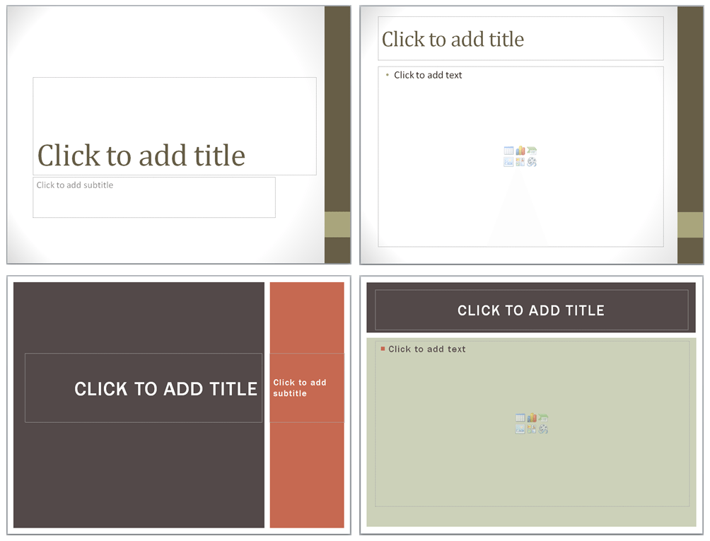
default powerpoint templates

Regardless of what you choose from the built-in gallery, you’ll always end up with something that looks closely similar  to another template. Sure, there might be variations in style and color but the structure remains the same throughout. While it’s definitely easier to just add what you need inside placeholders, you’ll still end up with something that looks a lot like what others have seen before.

powerpoint templates layouts

Should you sacrifice great design in order to meet your deadline?

Luckily, it’s not that hard to strike a balance between convenience and creativity. Even if you’re in a rush to finish your presentation, you can still aim to meet both objectives. In fact, there’s is one particular way you can improve the look of PowerPoint templates in a tight schedule.

Customize templates in the Slide Master view

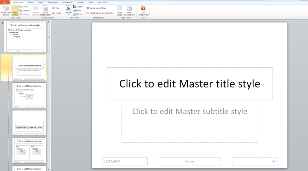
The Slide Master view is an easy way to customize everything in one go. Whether you decide to change up fonts, layouts, color schemes or backgrounds, anything you adjust will be applied throughout your presentation. This saves you from having to adjust every single detail to each individual slide. To get started, all you have to do is click on the View tab and choose “Slide Master” among the different options.

slide master view complete

Once in the Slide Master view, you can easily change up the template’s design by using the options available in the ribbon. Among the things you can do is create a new color scheme, choose a different background style, insert new placeholders and define a custom set of fonts. You have a lot of flexibility to explore different ways to create your own unique designs. After you become familiar with the Slide Master view, it will be far easier to customize templates in creative ways.

If you’re pressed for time, here are two simple things you can try to improve PowerPoint templates:

Change the slide layouts or create your own

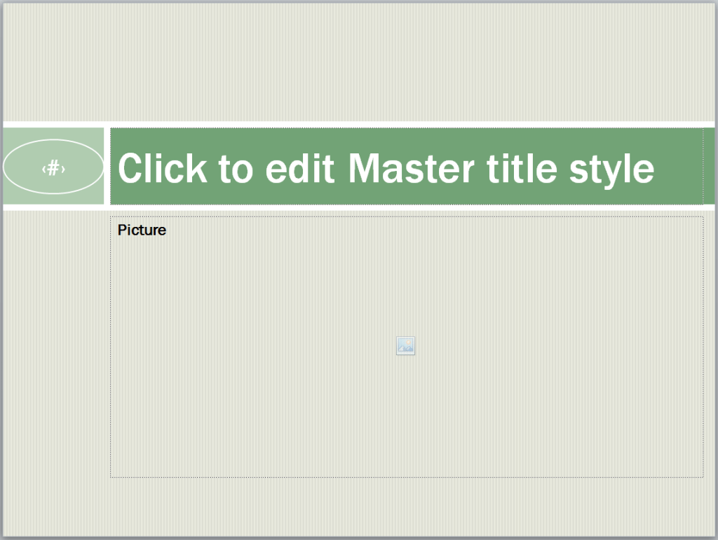
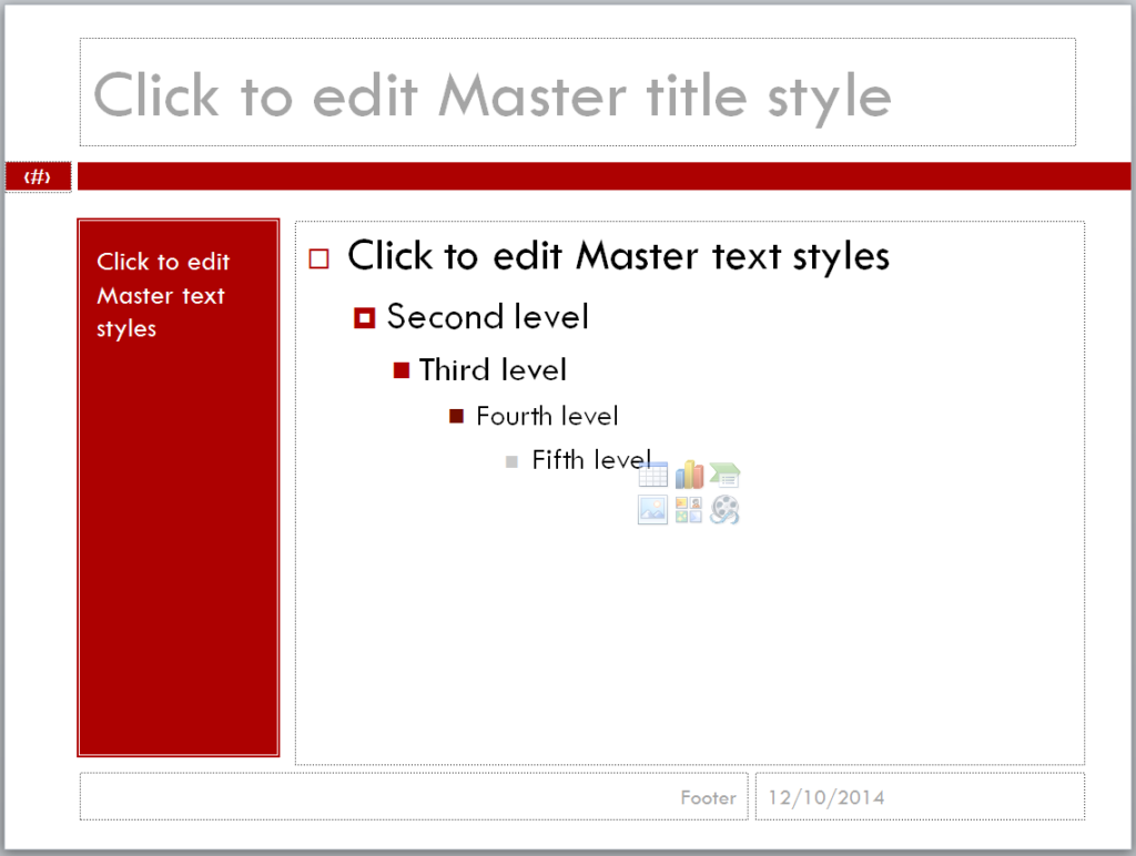
A simple way to change the look of PowerPoint templates is by manipulating the default slide layouts. Through the Slide Master view, you can change the place of particular design elements to come up with something more original.  All you have to do is add, delete, or move placeholders around.

slide master edit layout

Better yet, you can create a custom slide layout by choosing “Insert Layout” from the ribbon. Anything you come up with will be available under “Layout” once revert back to Normal view. At this stage, think of what you commonly see in PowerPoint presentations and aim for the opposite direction. Try to experiment with new layouts.

Create a new color scheme and font set that reflects your brand

Another way to customize PowerPoint templates is by creating something that’s particular to your brand. As we’ve discussed in the past, color and font are essential elements to your company’s logo. By following the same theme in your presentation, you can easily come up with a template that matches your branding.

slide master edit color

While in Slide Master view, click on “Colors” under the “Edit Theme” group. Click on the “Create New Theme Colors” option to define you own color scheme. You can also scroll down the options to find something that resembles your brand colors and customize it following the same steps. The same directions apply for defining a new font set. All you have to do is click on “Fonts” and select “Create New Theme Fonts”.

In an ideal scenario, you’ll have plenty of time to prepare for your big presentation. Reality, however, isn’t always that convenient. If you have very little time to create great PowerPoint designs, you can use the Slide Master view to customize default templates. PowerPoint is a flexible presentation tool. You only have to explore and experiment to get the best results.

Learn more about using the Slide Master view: 

Featured Image: Startup Stock Photos

Pitch Deck Design Tips for Presenting Data

Dealing with data is a crucial part of any pitch deck. When the stakes are particularly high, presenting data is the best way to add weight and leverage to your ideas. If you want to make sure your pitch holds up, you need to provide evidence that will support your main arguments.

The only problem with data is when you have too much. As we’ve constantly established, simplicity is an important factor in pitch deck design. How can facts and figures be helpful if they only end up confusing your audience? When it comes to presenting data, you’ll need to cut back on complex graphs and lengthy explanations. The best way to present data is through concise visuals that are both striking and creative.

pitchdeck.com Blog Module Three

Get hundreds of pitch deck slides for free.

Sign up for your free account today.

Sign Up now

Before anything else, you need to think of data in your pitch deck as an iceberg. The part we see floating in water is said to make up only 10% of its entire mass. The rest of it is underwater, hidden from plain sight. Similarly, the data you include in your pitch deck should only be a small part of the information you have available. A lot of research and hard work goes into gathering data for a pitch deck, but you can’t expect to include everything in your slides.

Data in your presentations should act like an iceberg
Like an iceberg, don’t show your audience every bit of information you have. The data in your pitch deck should only be a small part of everything you’ve gathered during research and preparation. (Source)

In other words, the data you include in your pitch deck should be the ones that are most crucial to making your point. Before you start building your slides, review the information you have and figure out what each stands for in relation to your core message. The numbers that stand out the most are the most significant to your key arguments.

With that said, here are a few more tips to keep in mind when you’re presenting data:

Figure out the best way to visualize your data

After deciding which of the information you have is the most relevant to your pitch, the next thing you need to do is to turn your data into visuals. Review the different types of charts to find out which one works best for the numbers you have. Check out these resources to learn more about choosing the most suitable format for your data:

The charts in your pitch deck should make sense without too much explanation. Make sure you choose the correct format so that you can get the simplest and most streamlined illustration. Basically, line and bar charts are great for emphasizing trends. Meanwhile, a pie chart is perfect for illustrating how specific numbers correspond to a whole.

chart data sample

There are also times when it’s better to avoid using charts at all. Certain data is better presented through a simple illustration. If you’re not comparing several numbers, maybe a single but striking graphic is enough to prove your point.

illustration data sample

Be creative with your visualization 

Presenting data doesn’t have to be boring, so keep your visuals interesting. It’s not enough to turn your data into simple charts or illustrations. You also need to take note of a few pitch deck design principles.

In our discussion on top pitch deck design practices, we discussed how some factors—particularly the use of images, color, and space—can make a huge difference in the look of your slides. If you want your data to pop, make sure you learn how to use and manipulate these elements in your visualizations. Look through our portfolio for inspiration.

black friday data
Data about Black Friday shoppers visualized in an infographic on Visual.ly

Highlight the insights 

Aside from great design, it’s also important to highlight what your data is about. When it comes to presenting data, the audience isn’t particularly interested in seeing exact figures. What they want to see is the logic behind the numbers. Why are they important? What point are they trying to make?

To avoid confusing the audience, make sure your slides feature a short explanation of your data. Caption your charts or illustrations with a few short sentences that can briefly explain what your data represents. Here’s another example from the pitchdeck.com portfolio:

RecoverBrands_1

When you’re delivering your pitch, it will also help if you lead with the conclusion. To present everything clearly, you’ll need to show the bigger picture before going in to the finer points of your data.

pitchdeck.com Blog Module Two

Download free pitch deck templates now.

Get professionally designed pitch deck slides weekly.

Sign Up Now

Featured Image: Nic McPhee via Flickr