
Dealing with data is a crucial part of any pitch deck. When the stakes are particularly high, presenting data is the best way to add weight and leverage to your ideas. If you want to make sure your pitch holds up, you need to provide evidence that will support your main arguments.
The only problem with data is when you have too much. As we’ve constantly established, simplicity is an important factor in pitch deck design. How can facts and figures be helpful if they only end up confusing your audience? When it comes to presenting data, you’ll need to cut back on complex graphs and lengthy explanations. The best way to present data is through concise visuals that are both striking and creative.

Before anything else, you need to think of data in your pitch deck as an iceberg. The part we see floating in water is said to make up only 10% of its entire mass. The rest of it is underwater, hidden from plain sight. Similarly, the data you include in your pitch deck should only be a small part of the information you have available. A lot of research and hard work goes into gathering data for a pitch deck, but you can’t expect to include everything in your slides.

In other words, the data you include in your pitch deck should be the ones that are most crucial to making your point. Before you start building your slides, review the information you have and figure out what each stands for in relation to your core message. The numbers that stand out the most are the most significant to your key arguments.
With that said, here are a few more tips to keep in mind when you’re presenting data:
Figure out the best way to visualize your data
After deciding which of the information you have is the most relevant to your pitch, the next thing you need to do is to turn your data into visuals. Review the different types of charts to find out which one works best for the numbers you have. Check out these resources to learn more about choosing the most suitable format for your data:
- Charts and Graphs – Mind Tools
- How to Use 6 Basic Charts to Create Effective Reports – Fluid Surveys
- Chart Types and their Uses – SAP Design Guild
The charts in your pitch deck should make sense without too much explanation. Make sure you choose the correct format so that you can get the simplest and most streamlined illustration. Basically, line and bar charts are great for emphasizing trends. Meanwhile, a pie chart is perfect for illustrating how specific numbers correspond to a whole.
There are also times when it’s better to avoid using charts at all. Certain data is better presented through a simple illustration. If you’re not comparing several numbers, maybe a single but striking graphic is enough to prove your point.

Be creative with your visualization
Presenting data doesn’t have to be boring, so keep your visuals interesting. It’s not enough to turn your data into simple charts or illustrations. You also need to take note of a few pitch deck design principles.
In our discussion on top pitch deck design practices, we discussed how some factors—particularly the use of images, color, and space—can make a huge difference in the look of your slides. If you want your data to pop, make sure you learn how to use and manipulate these elements in your visualizations. Look through our portfolio for inspiration.
Highlight the insights
Aside from great design, it’s also important to highlight what your data is about. When it comes to presenting data, the audience isn’t particularly interested in seeing exact figures. What they want to see is the logic behind the numbers. Why are they important? What point are they trying to make?
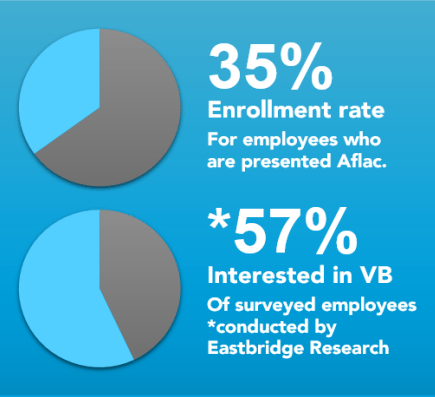
To avoid confusing the audience, make sure your slides feature a short explanation of your data. Caption your charts or illustrations with a few short sentences that can briefly explain what your data represents. Here’s another example from the pitchdeck.com portfolio:
When you’re delivering your pitch, it will also help if you lead with the conclusion. To present everything clearly, you’ll need to show the bigger picture before going in to the finer points of your data.

Download free pitch deck templates now.
Get professionally designed pitch deck slides weekly.
Sign Up NowFeatured Image: Nic McPhee via Flickr
