Slidegenius, Inc.

You’re Doing It Wrong: PowerPoint Rules You Should Be Following

For years now, people have been relying on PowerPoint to communicate ideas, sell products, facilitate meetings, and conferences. Many presenters, however, still fall short and end up with lousy, poorly designed slides that do nothing but torture their audience. Thankfully, there are experts in the field who have set the rules or standards for others to follow.

pitchdeck.com Blog Module Three

Get hundreds of pitch deck slides for free.

Sign up for your free account today.

Sign Up now

After a quick search, we found two sets of the most popular PowerPoint rules that many people subscribe to. Both may not be all-encompassing but they are excellent guidelines, nonetheless.

Guy Kawasaki’s 10/20/30 Rule of PowerPoint

Guy Kawasaki is a venture capitalist, among other things. If we’re going to talk about quality and importance of simplicity in pitch deck design, he’s the go-to, well, Guy. He practically listens to hundreds of pitches all the time, making him knowledgeable of what works and doesn’t. For him, a pitch deck presentation should:

  • Feature 10 slides or less
  • Last no more than 20 minutes
  • Contain font not smaller than 30pt

This rule is applicable to pitches and office meetings. And because most people cannot absorb more than 10 concepts in a single meeting, it is best that you limit your pitch deck to 10 slides. The 20-minute duration should give you enough time to host a Q and A discussion afterwards. A 30-point typeface will make information on a slide large enough to be readable without making it look too crowded.

Seth Godin’s Five Rules for Creating Amazing Pitch Decks

Seth Godin is a man of many interests and as a public speaker, he’s no stranger to PowerPoint presentations. He even wrote an e-book about it.

If you want to create an amazing pitch deck, here are the points we have taken from the book:

  1. Use no more than six words on every slide (If you include too much text, the audience will simply read the slides ahead of you).
  2. Do not use cheesy images and look for professional stock photos instead.
  3. Avoid fancy transitions such as dissolves, spins, etc, as these can be distracting, making you seem less professional.
  4. Use sound effects, but not the built-in types. You may want to rip from CDs or use the “Proust effect.”
  5. Do not provide print collateral at the start of the meeting. You want your audience to focus on the presentation, not read ahead of you.

Great pitch decks can trigger the right emotions, inspire change, and move people. These two sets of rules can raise the level of your next pitch from boring to life-changing. You don’t need to choose between the two, though. Applying both of them is sure to produce excellent results. But whatever you do, here’s another rule for you to remember. This one’s from presentation expert Nancy Duarte:

Never deliver a presentation you would not want to sit through.

Now, if there’s One Pitch Deck Rule to rule them all, that would be it.

pitchdeck.com Blog Module Two

Download free pitch deck templates now.

Get professionally designed pitch deck slides weekly.

Sign Up Now

Designing a ‘How It Works’ Slide That Works

Do you find it difficult to explain to someone how a product, service, or process works? If your business involves selling new products or you’re constantly introducing new service features, then you’ll need an easy way to explain things. This is where the “How It Works” slides come in.

Explaining how certain things work is one of the most common uses of pitch deck slides. Done right, a “how it works” pitch deck can be effective for product demos, process flow illustrations, or pitching a business idea. To help you get started out, here are some ways you can make this type of slide work:

Lay it out

Pitch deck has several types of slide layouts. The default type comes with two boxes: The text box at the top, which is for the title of the slide, and the middle box, which is a multipurpose placeholder for text, graphics, or any content types.

For this purpose, however, you may choose the blank layout type and then simply insert the content that you need. Or better yet, as with the above slide, choose the Title Only template before putting all the other elements. To enhance the effect of your slide, feel free to choose from the Shapes and SmartArt Graphics.

Be consistent with colors

This one is pretty basic although there are still those who take it for granted. Buffer‘s Leonhard Widrich writes about how color schemes can affect our perception of a brand. The more recognizable colors have effectively been associated with specific brands, while those that were more difficult to point out didn’t have such a good color combination.

Similarly, pitch deck slides should have similar color schemes as they can affect the overall impact of your message.

Using varying combinations for different slides can confuse your audience. So for best results, make the color scheme of your How It Works slide consistent with the rest of your deck. This also applies to the slide itself. Looking at the above sample, you’ll notice that the color of the iVoteLIVE logo is consistent with that of the template. Apart from that, most of the imagery (i.e., photos and graphics) have similar shades of colors. This makes the slide pleasant to look at.

Take it easy with texts

This is another common concern and when it comes to How It Works slides, we can’t stress enough its importance. The purpose of slides is to describe visually something you can’t explain verbally. Why spend 15 minutes explaining a new feature, when a couple of images will take you just a few seconds, right?

If you’re going to include some texts, make sure not to mix up the fonts and font sizes just for the heck of it. Otherwise, your slide will appear visually confusing. Take a look at the sample again. While the format of the texts describing the consumers is different from the texts indicating the features (iVoteLive computer interface, Live Program Broadcasts), they still work because each group has specific purpose.

In short, they are not randomly mixed up.

The Takeaway: Engage with imagery

In general, images can make it easier for people to understand and remember ideas. So use relevant imagery instead of text in parts where you think a visual element would work better. When using images, though, be sure that they are of appropriate quality.

For scanned images, the ideal resolution is between 150 dpi (when precise color reproduction is not required) and 300 dpi (if you need higher quality images).

As much as possible, do not take images from the Internet as they usually of a very low quality and might pixelate when projected on a screen.

Reference

Widrich, Leonhard. “Why Is Facebook Blue? The Science of Colors in Marketing.” The Huffington Post. January 16, 2014. Accessed May 20, 2014.

Why We Are Different: Creating A Slide That Highlights Your Competitive Edge

Today, most mainstream markets are becoming more and more saturated and difficult to penetrate, especially for budding entrepreneurs. This leads to companies and brands simply imitating each other in terms of features and benefits. But for those in these precarious market situations, customers have heard it all, and they’re not that impressed.

Defining your competitive edge can help establish your unique position in the market. With clearly defined benefits and features, your customers will know what really makes you a cut above the competitors and what steps you need to take to maintain that position.

Here’s how you can craft a slide stating your specific advantages:

Say it Fast

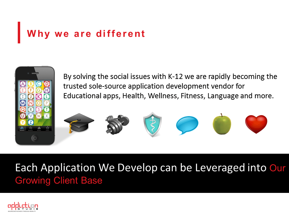
The “Why We Are Different” slide is a common fixture in corporate profile pitch decks.

Ironically, many organizations use the same strategy in describing the things that differentiate them from the crowd: They use bullet points. Enumerating your best qualities isn’t exactly the best way to present your competitive edge. If you can say it one sentence, the stronger your impact will be.

This doesn’t mean that you’ll be leaving out important details from your slide. It only means compressing the important points in one non-highfaluting and simple-to-understand sentence. Since we’re talking about customers who are tired of hearing the same things over and over, a brief but enlightening slide is a breath of fresh air for their tired gaze. Try to be as concise as possible in your slide. Don’t go off on tangent unless necessary.

why we are different

Back it Up

Another effective way to describe your edge over the competition is this: Don’t make it about the competition.

Make it client-driven. You can do this by identifying your customer base and describing the solution to their problem.

For most of your customers, you are the ideal provider not because of flashy advertising or due to popular choice, but because you are able to address their needs and challenges. In an interview with LoyalBlocks’ Ido Gaver, Kevin Daum enumerates the ways you can back up your statements and show your sincerity.

Show people that their loyalty to you has perks — whether it’s in terms of addressing them personally, or giving them perks like promos and freebies. Build and maintain your competitive edge on that opportunity.

Say it Loud

Now that you have an idea of what your competitive edge really is, it’s time to declare it to the world using your slide. You don’t need to use big, highfalutin words.

Simple words would be enough, as long as they sound sincere, not condescending and inappropriate. Use images to support your text. Make sure they are relevant and do not detract from what you want to say. An effective slide that aims to set you apart from the competition will only succeed if you bring together strategic techniques to the table.

Reference

Daum, Kevin. “7 Great Ways to Build Customer Loyalty.” Inc.com. January 13, 2014. Accessed May 15, 2014.

Why We Are Different: Highlighting Your Competitive Edge

Today, most mainstream markets are becoming more saturated and difficult to penetrate, especially for budding entrepreneurs. This leads to companies and brands simply imitating each other in terms of features and benefits. But for those in these precarious market situations, customers have heard it all, and they’re not that impressed.

Defining your competitive edge can help establish your unique position in the market. With clearly defined benefits and features, your customers will know what really makes you a cut above the competitors and what steps you need to take to maintain that position.

pitchdeck.com Blog Module Three

Get hundreds of pitch deck slides for free.

Sign up for your free account today.

Sign Up now

Here’s how you can craft a slide stating your specific advantages:

Say it Fast

The “Why We Are Different” slide is a common fixture in corporate profile pitch decks.

Ironically, many organizations use the same strategy in describing the things that differentiate them from the crowd: They use bullet points. Enumerating your best qualities isn’t exactly the best way to present your competitive edge. If you can say it one sentence, the stronger your impact will be.

This doesn’t mean that you’ll be leaving out important details from your slide. It only means compressing the important points in one non-highfalutin and simple-to-understand sentence. Since we’re talking about customers who are tired of hearing the same things over and over, a brief but enlightening slide is a breath of fresh air for their tired gaze. Try to be as concise as possible in your slide. Don’t go off on tangent unless necessary.

why we are different

Back it Up

Another effective way to describe your edge over the competition is this: Don’t make it about the competition.

Make it client-driven. You can do this by identifying your customer base and describing the solution to their problem.

For most of your customers, you are the ideal provider not because of flashy advertising or due to popular choice, but because you are able to address their needs and challenges. In an interview with LoyalBlocks’ Ido Gaver, Kevin Daum enumerates the ways you can back up your statements and show your sincerity.

Show people that their loyalty to you has perks—whether it’s in terms of addressing them personally, or giving them perks like promos and freebies. Build and maintain your competitive edge on that opportunity.

Say it Loud

Now that you have an idea of what your competitive edge really is, it’s time to declare it to the world using your slide. You don’t need to use big, highfalutin words.

Simple words would be enough, as long as they sound sincere, not condescending and inappropriate. Use images to support your text. Make sure they are relevant and do not detract from what you want to say. An effective slide that aims to set you apart from the competition will only succeed if you bring together strategic techniques to the table.

pitchdeck.com Blog Module Two

Download free pitch deck templates now.

Get professionally designed pitch deck slides weekly.

Sign Up Now