Slidegenius, Inc.

5 Dashboard Visualizations to Help Boost Sales

Data visualization, to put it simply, is the presentation of data in a graphical format. This involves turning analytics and insights presented in a way other than textually, making difficult concepts much easier to comprehend. 

The human brain processes information much easier when presented with large amounts of data translated into charts and graphs.  

Using visuals is a quick and easy way to convey complex concepts in a manner that everyone can understand. 

Data visualization, therefore, can: 

  • Identify areas of improvement 
  • Clarify which factors influence customer behavior 
  • Help allocate products 
  • Predict sales volumes 

In many industries, sales in particular, seeing is believing. The ability to view information and apply solutions in real-time is important. 

So, here are five essential dashboard data visualizations that sales teams can use to improve their performance and boost their sales advantage.

Geographical Heatmaps 

Also known as “choropleth maps,” these refer to a color-coded matrix that represents value or risk. These are maps of countries or cities, highlighted or annotated to show numbers. 

Preparing and analyzing heatmaps are incredibly easy. These could be up and running just by merely translating the necessary data. This type of data visualization is usually quicker to interpret than numbers at first glance because its colors usually range from green (good values) to red (bad values). 

An example of sales teams using heatmaps would be when they’re determining their target demographic—a consensus of households that would be interested in their products. 

SG_5-Dashboard-Visualizations-_Supporting-Image-01_SG01

Bubble Charts/Word Clouds 

Bubbles charts are similar to heatmaps, only that the objects that represent values are, well, bubbles. You can use colors can to represent values for this type of data visualization. 

Word clouds look like jumbled words that seem to have no correlation until given context. These are clusters of words in different sizes. The bigger and bolder they appear, the more often they are mentioned in a text—the more important they are.  

In this text for example, you will see the word “data” 13 times. If it were to appear as a word cloud, it would appear to be the biggest word.

Waterfall Charts 

To better understand finances, waterfall charts help translate financial data and project a clearer picture of how gains, losses, and balances are affecting bottomline. 

To put it in the context of marketing, another example would be how leads and blog traffic in the last year could be affecting your business.  

Radar Charts 

Also referred to as “spider charts,” these best visualize multiple performance variables that are sub-components of other variables. When you’re uncertain about the units of measurement used, these provide a rough estimate. 

An example would be gauging customer experience after purchasing a product. The different variables would include price, customer support quality, ease of the sales process, and user-friendliness of the service.  

SG_5-Dashboard-Visualizations-_Supporting-Image-02_SG01

Bullet/Gauge Charts 

Gauge charts, also referred to as dial or speedometer charts, represent one metric at a time. Their goal is simple: to show how close you are to achieving a certain goal.  

Say you’re aiming for a certain number of leads for a project. Assume that number is 100 and you’re only at the 65 mark. It’s easier to visualize that using a gauge chart. Apart from that, you’d know how important this value is to the discussion since it is emphasized in graphical form.

Today, as data collection becomes more streamlined, information becomes abundant, meaning there’s so much to learn. The only problem is, not everyone can comprehend all this.  

Data visualization is an effective strategy if you want to translate complex datasets into information that is more concise, straightforward, and understandable to those who are not familiar with the concept you are discussing. 

It continues to help sales teams and analysts look at data more imaginatively. Ultimately, this is a useful skill to develop, effectively conveying and leveraging information in a visual format. 

Pitch Deck Design Tips for Presenting Data

Dealing with data is a crucial part of any pitch deck. When the stakes are particularly high, presenting data is the best way to add weight and leverage to your ideas. If you want to make sure your pitch holds up, you need to provide evidence that will support your main arguments.

The only problem with data is when you have too much. As we’ve constantly established, simplicity is an important factor in pitch deck design. How can facts and figures be helpful if they only end up confusing your audience? When it comes to presenting data, you’ll need to cut back on complex graphs and lengthy explanations. The best way to present data is through concise visuals that are both striking and creative.

pitchdeck.com Blog Module Three

Get hundreds of pitch deck slides for free.

Sign up for your free account today.

Sign Up now

Before anything else, you need to think of data in your pitch deck as an iceberg. The part we see floating in water is said to make up only 10% of its entire mass. The rest of it is underwater, hidden from plain sight. Similarly, the data you include in your pitch deck should only be a small part of the information you have available. A lot of research and hard work goes into gathering data for a pitch deck, but you can’t expect to include everything in your slides.

Data in your presentations should act like an iceberg
Like an iceberg, don’t show your audience every bit of information you have. The data in your pitch deck should only be a small part of everything you’ve gathered during research and preparation. (Source)

In other words, the data you include in your pitch deck should be the ones that are most crucial to making your point. Before you start building your slides, review the information you have and figure out what each stands for in relation to your core message. The numbers that stand out the most are the most significant to your key arguments.

With that said, here are a few more tips to keep in mind when you’re presenting data:

Figure out the best way to visualize your data

After deciding which of the information you have is the most relevant to your pitch, the next thing you need to do is to turn your data into visuals. Review the different types of charts to find out which one works best for the numbers you have. Check out these resources to learn more about choosing the most suitable format for your data:

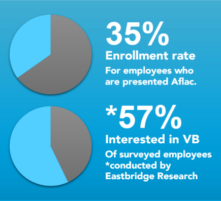
The charts in your pitch deck should make sense without too much explanation. Make sure you choose the correct format so that you can get the simplest and most streamlined illustration. Basically, line and bar charts are great for emphasizing trends. Meanwhile, a pie chart is perfect for illustrating how specific numbers correspond to a whole.

chart data sample

There are also times when it’s better to avoid using charts at all. Certain data is better presented through a simple illustration. If you’re not comparing several numbers, maybe a single but striking graphic is enough to prove your point.

illustration data sample

Be creative with your visualization 

Presenting data doesn’t have to be boring, so keep your visuals interesting. It’s not enough to turn your data into simple charts or illustrations. You also need to take note of a few pitch deck design principles.

In our discussion on top pitch deck design practices, we discussed how some factors—particularly the use of images, color, and space—can make a huge difference in the look of your slides. If you want your data to pop, make sure you learn how to use and manipulate these elements in your visualizations. Look through our portfolio for inspiration.

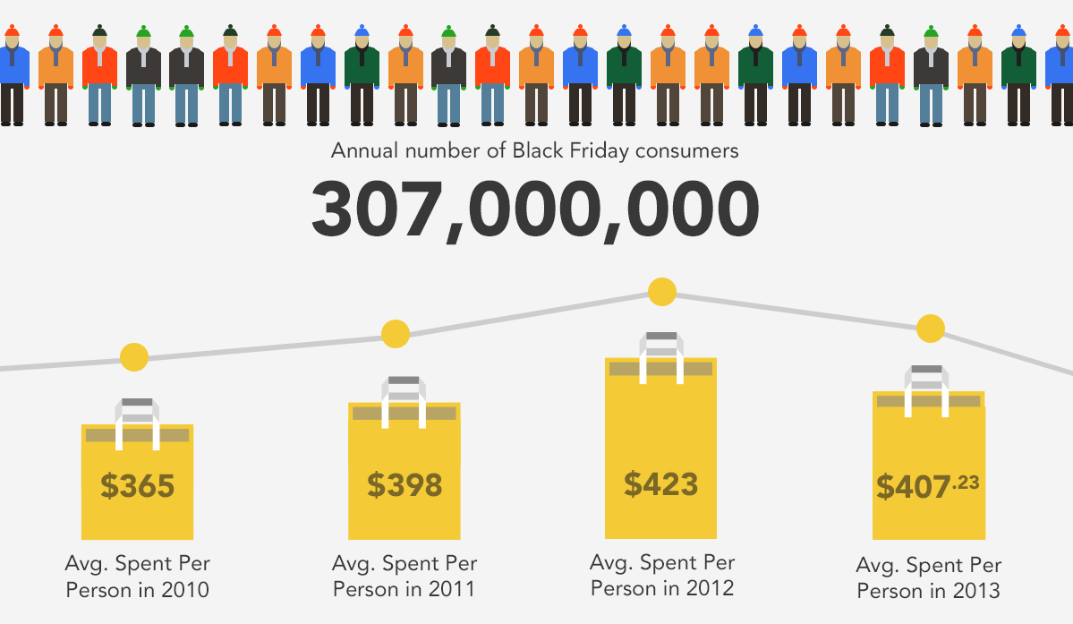
black friday data
Data about Black Friday shoppers visualized in an infographic on Visual.ly

Highlight the insights 

Aside from great design, it’s also important to highlight what your data is about. When it comes to presenting data, the audience isn’t particularly interested in seeing exact figures. What they want to see is the logic behind the numbers. Why are they important? What point are they trying to make?

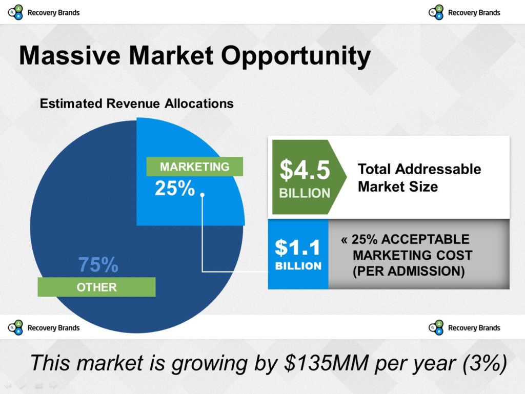
To avoid confusing the audience, make sure your slides feature a short explanation of your data. Caption your charts or illustrations with a few short sentences that can briefly explain what your data represents. Here’s another example from the pitchdeck.com portfolio:

RecoverBrands_1

When you’re delivering your pitch, it will also help if you lead with the conclusion. To present everything clearly, you’ll need to show the bigger picture before going in to the finer points of your data.

pitchdeck.com Blog Module Two

Download free pitch deck templates now.

Get professionally designed pitch deck slides weekly.

Sign Up Now

Featured Image: Nic McPhee via Flickr